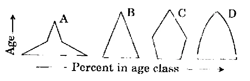
Consider the four age pyramids given below namely A, B, C and D representing four different countries.
Which one of them indicates the declining population?
(a)A
(b)B
(c)CUPSC key
(d)D
Show answerHide answer
UPSC key: (c)
Data interpretation and sufficiency · Graphs
2011 · Q13
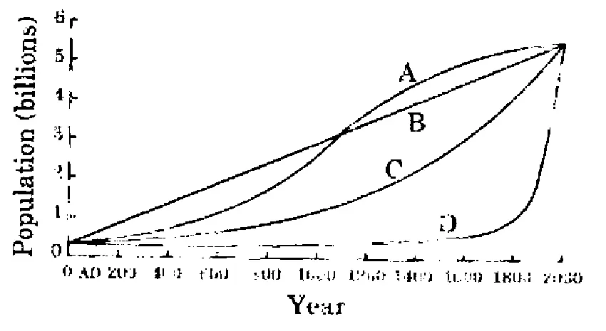
The following figure has four curves namely A, B, C and D. Study the figure and answer the item that follows.
Which curve indicates the exponential growth?
(a)A
(b)B
(c)CUPSC key
(d)D
Show answerHide answer
UPSC key: (c)
Data interpretation and sufficiency · Graphs
Directions
Directions for the following 2 (two) items:
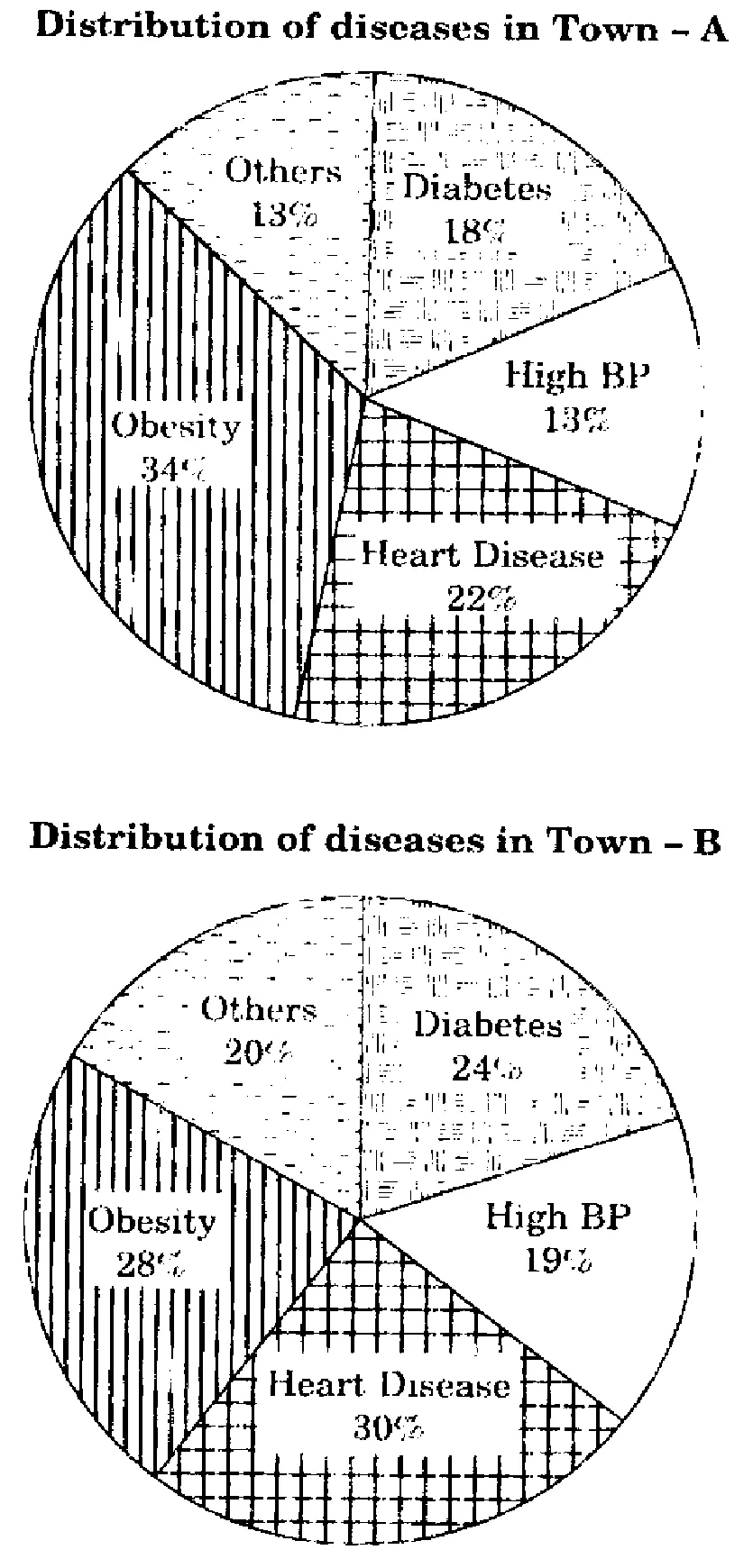
The following pie charts show the break up of disease categories recorded in the patients from two towns, Town A and Town B. Pie charts plot the disease categories as percentage of the total number of patients. Based on these, answer the two items that follow the charts.
2011 · Q14
Which of the two towns has a higher number of persons with Diabetes?
(a)Town A
(b)Town B
(c)Same in Town A and Town B
(d)No inference can be drawnUPSC key
Show answerHide answer
UPSC key: (d)
Data interpretation and sufficiency · Graphs
2011 · Q15
What can we say about persons with more than one disease from these graphs?
(a)There are likely to be persons with more than one disease in Town A.
(b)There are likely to be persons with more than one disease in Town B.UPSC key
(c)There are likely to be persons with more than one disease in both Towns A and B.
(d)No inference can be drawn.
Show answerHide answer
UPSC key: (b)
Data interpretation and sufficiency · Graphs
2011 · Q16
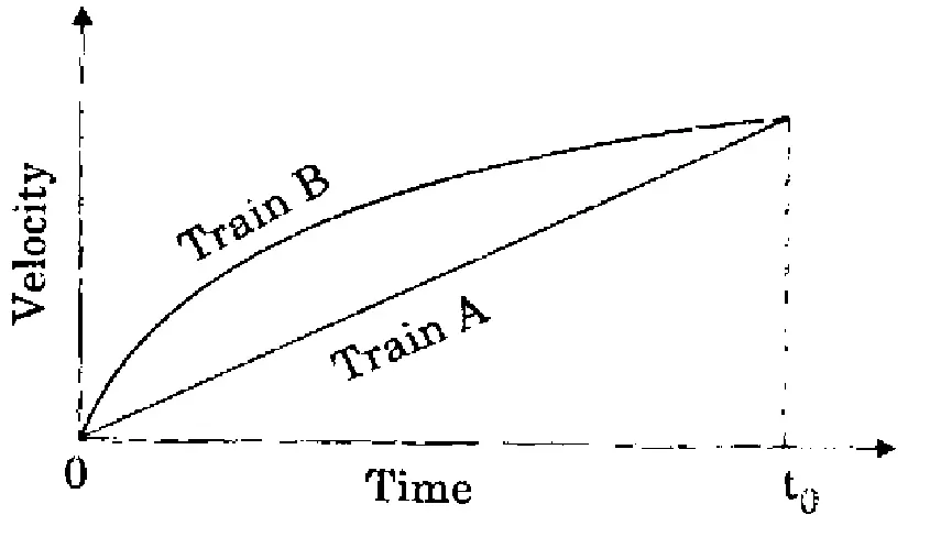
Consider the following Velocity - Time graph. It shows two trains starting simultaneously on parallel tracks.
With reference to the above graph, which one of the following statements is not correct?
(a)Train B has an initial acceleration greater than that of Train A.
(b)Train B is faster than Train A at all times.
(c)Both trains have the same velocity at time t₀.
(d)Both trains travel the same distance in time t₀ units.UPSC key
Show answerHide answer
UPSC key: (d)
Data interpretation and sufficiency · Graphs
2011 · Q23
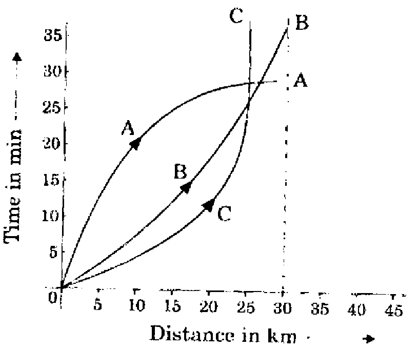
Consider the following distance - time graph. The graph shows three athletes A, B and C running side by side for a 30 km race.
With reference to the above graph, consider the following statements:
1.The race was won by A
2.B was ahead of A up to 25 km mark
3.C ran very slowly from the beginning.
Which of the statements given above is/are correct?
(a)1 only
(b)1 and 2 onlyUPSC key
(c)2 and 3 only
(d)1, 2 and 3
Show answerHide answer
UPSC key: (b)
Data interpretation and sufficiency · Graphs
Passage
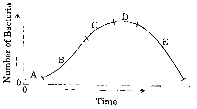
During a party, a person was exposed to contaminated water. A few days later, he developed fever and loose motions. He suffered for some days before going to a doctor for treatment. On starting the treatment, he soon became better and recovered completely a few days later. The following graph shows different phases of the person's disease condition as regions A, B, C, D and E of the curve.
2011 · Q31
Which region/regions of the curve correspond/corresponds to incubation phase of the infection?
(a)A onlyUPSC key
(b)B only
(c)B and C
(d)No part of the curve indicates the incubation phase
Show answerHide answer
UPSC key: (a)
Data interpretation and sufficiency · Graphs
2011 · Q32
Which region of the curve indicates that the person began showing the symptoms of infection?
(a)A
(b)BUPSC key
(c)C
(d)D
Show answerHide answer
UPSC key: (b)
Data interpretation and sufficiency · Graphs
2011 · Q33
Which region of the curve indicates that the treatment yielded effective relief?
(a)C
(b)D
(c)EUPSC key
(d)The curve does not indicate the treatment
Show answerHide answer
UPSC key: (c)
Data interpretation and sufficiency · Graphs
2013
5 questions
Directions
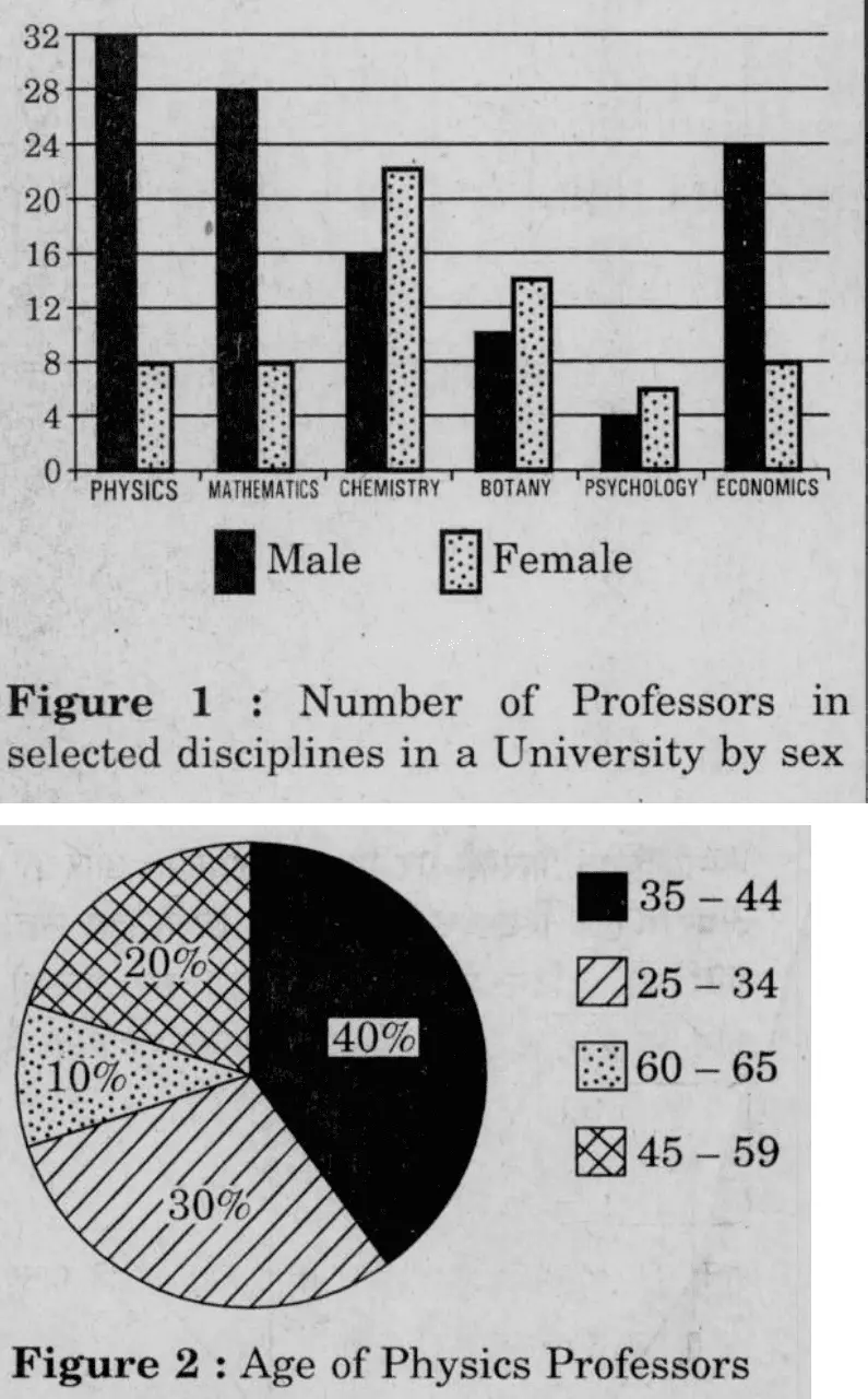
Direction for the following 5 (five) items: Study the two figures given below and answer the five items that follow:
2013 · Q52
How many Physics professors belong to the age group 35 – 44?
(a)18
(b)16UPSC key
(c)14
(d)12
Show answerHide answer
UPSC key: (b)
Data interpretation and sufficiency · Graphs
2013 · Q53
Which one of the following disciplines has the highest ratio of males to females?
(a)PhysicsUPSC key
(b)Mathematics
(c)Chemistry
(d)Economics
Show answerHide answer
UPSC key: (a)
Data interpretation and sufficiency · Graphs
2013 · Q54
What percentage of all Psychology professors are females?
(a)40%
(b)50%
(c)60%UPSC key
(d)70%
Show answerHide answer
UPSC key: (c)
Data interpretation and sufficiency · Graphs
2013 · Q55
If the number of female Physics professors in the age group 25 – 34 equals 25% of all the Physics professors in that age group, then what is the number of male Physics professors in the age group 25 – 34?
(a)9UPSC key
(b)6
(c)3
(d)2
Show answerHide answer
UPSC key: (a)
Data interpretation and sufficiency · Graphs
2013 · Q56
If the Psychology professors in the University constitute 2% of all the professors in the University, then what is the number of professors in the University?
(a)400
(b)500UPSC key
(c)600
(d)700
Show answerHide answer
UPSC key: (b)
Data interpretation and sufficiency · Graphs
2014
4 questions
Directions
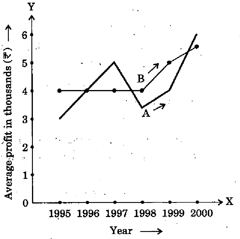
Directions for the following 4 (four) items: The following graph shows the average profit of two fruit-sellers A and B in thousands (₹) per year from the year 1995 to 2000. Consider the graph and answer the 4 (four) items that follow:
2014 · Q34
In which year is the average profit of A and B same?
(a)1995
(b)1996UPSC key
(c)1997
(d)1998
Show answerHide answer
UPSC key: (b)
Data interpretation and sufficiency · Graphs
2014 · Q35
What is the difference between the average profit of B and A in the year 1998?
(a)− ₹ 100
(b)− ₹ 1,000
(c)+ ₹ 600UPSC key
(d)− ₹ 300
Show answerHide answer
UPSC key: (c)
Data interpretation and sufficiency · Graphs
2014 · Q36
How much more average profit did A make in the year 2000 than in the year 1999?
(a)₹ 200
(b)₹ 1,000
(c)₹ 1,500
(d)₹ 2,000UPSC key
Show answerHide answer
UPSC key: (d)
Data interpretation and sufficiency · Graphs
2014 · Q37
What is the trend of the average profit of B from the year 1997 to the year 2000?
(a)Non-increasing
(b)Non-decreasingUPSC key
(c)Steady
(d)Fluctuating
Show answerHide answer
UPSC key: (b)
Data interpretation and sufficiency · Graphs
2015
3 questions
2015 · Q52
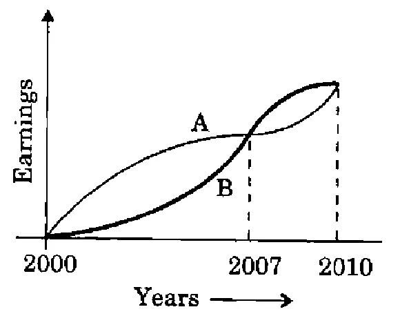
The graph below depicts the earnings of A and B over the period 2000 to 2010:
From the graph, which one of the following can be concluded?
(a)On the average A earned more than B during this period.UPSC key
(b)On the average B earned more than A during this period.
(c)The earnings of A and B were equal during this period.
(d)The earnings of A were less as compared to B during this period.
Show answerHide answer
UPSC key: (a)
Data interpretation and sufficiency · Graphs
2015 · Q58
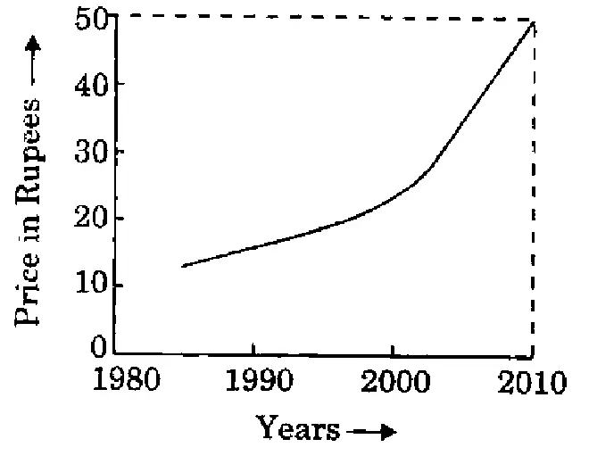
Year-wise variation of the price of a certain commodity is shown in the following graph:
The price of the commodity in the year 1990
(a)must have been ₹ 10/-
(b)must have been ₹ 12/-
(c)must have been anywhere between ₹ 10/- and ₹ 20/-UPSC key
(d)is higher than that in the year 1991
Show answerHide answer
UPSC key: (c)
Data interpretation and sufficiency · Graphs
2015 · Q59
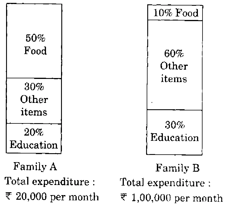
The proportion of expenditure on various items by two families A and B are represented in the following Bar Charts:
From these charts, we can conclude that
(a)Family A spent more money on food than Family B.
(b)Family B spent more money on food than Family A.
(c)Family A and Family B spent the same amount on food.UPSC key
(d)The expenditure on food by Family A and Family B cannot be compared.
Show answerHide answer
UPSC key: (c)
Data interpretation and sufficiency · Graphs
2018
11 questions
Directions
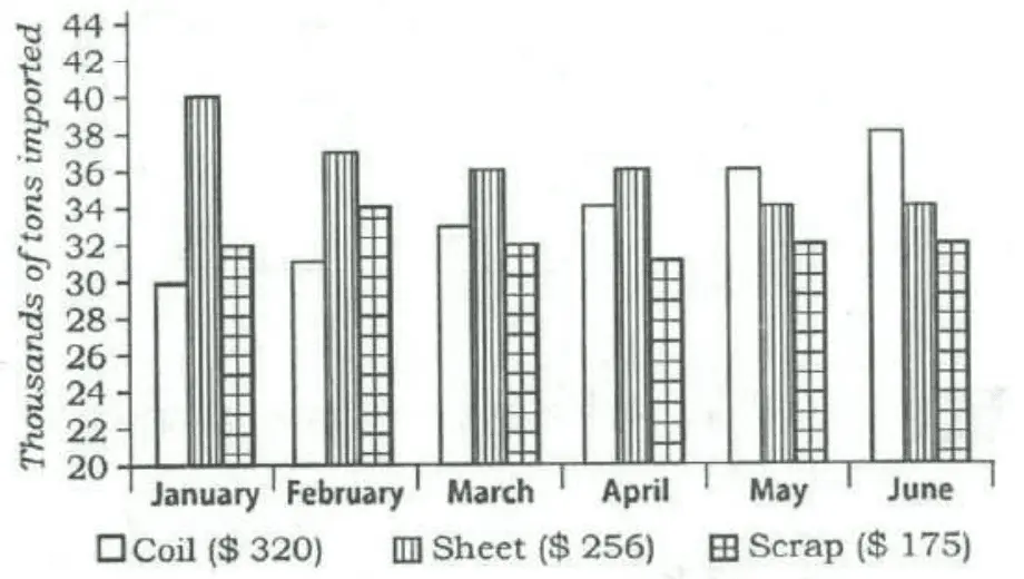
Directions for the following 3 (three) items: The following three items are based on the graph given below which shows imports of three different types of steel over a period of six months of a year. Study the graph and answer the three items that follow.
2018 · Q11
By how much (measured in thousands of tons) did the import of sheet steel exceed the import of coil steel in the first three months of the year?
(a)11
(b)15
(c)19UPSC key
(d)23
Show answerHide answer
UPSC key: (c)
Data interpretation and sufficiency · Graphs
2018 · Q12
What was the approximate total value (in $) of sheet steel imported over the six months period?
(a)45,555
(b)50,555
(c)55,550UPSC key
(d)65,750
Show answerHide answer
UPSC key: (c)
Data interpretation and sufficiency · Graphs
2018 · Q13
What was the approximate ratio of sheet steel and scrap steel imports in the first three months of the year?
(a)1: 1
(b)1·2: 1UPSC key
(c)1·4: 1
(d)1·6: 1
Show answerHide answer
UPSC key: (b)
Data interpretation and sufficiency · Graphs
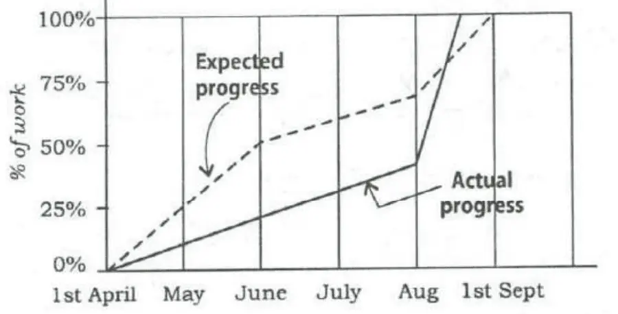
2018 · Q61
Consider the following graph:
Which one of the following statements is not correct with reference to the graph given above?
(a)On 1st June, the actual progress of work was less than expected.
(b)The actual rate of progress of work was the greatest during the month of August.
(c)The work was actually completed before the expected time.
(d)During the period from 1st April to 1st September, at no time was the actual progress more than the expected progress.UPSC key
Show answerHide answer
UPSC key: (d)
Data interpretation and sufficiency · Graphs
Directions
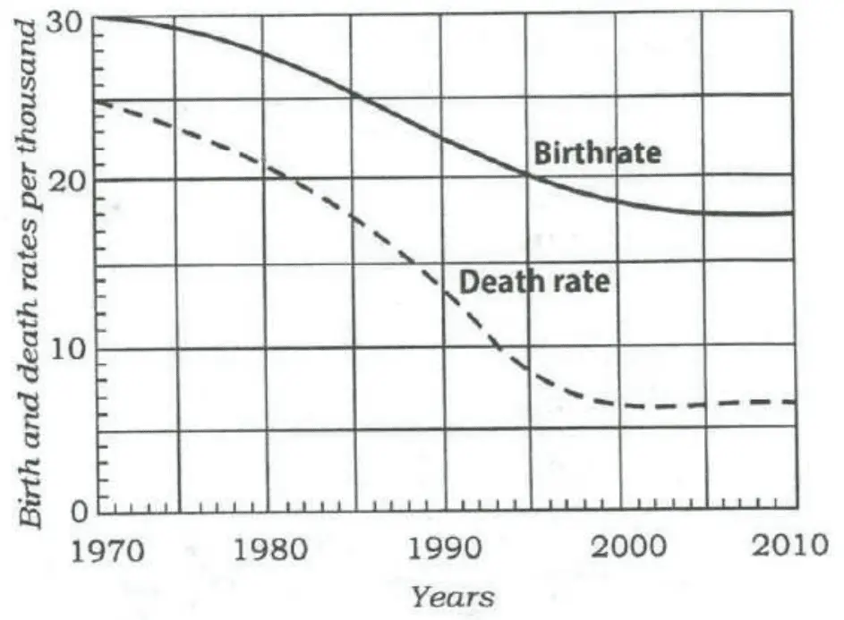
Directions for the following 2 (two) items: Consider the following graph in which the birthrate and death rate of a country are given, and answer the two items that follow.
2018 · Q63
Looking at the graph, it can be inferred that from 1990 to 2010
(a)population growth rate has increased
(b)population growth rate has decreased
(c)growth rate of population has remained stable
(d)population growth rate shows no trendUPSC key
Show answerHide answer
UPSC key: (d)
Data interpretation and sufficiency · Graphs
2018 · Q64
With reference to the above graph, consider the following statements considering 1970 as base year:
1.Population has stabilized after 35 years.
2.Population growth rate has stabilized after 35 years.
3.Death rate has fallen by 10% in the first 10 years.
4.Birthrate has stabilized after 35 years.
Which of the above are the most logical and rational statements that can be made from the above graph?
(a)1 and 2 only
(b)1, 2 and 3
(c)3 and 4
(d)2 and 4UPSC key
Show answerHide answer
UPSC key: (d)
Data interpretation and sufficiency · Graphs
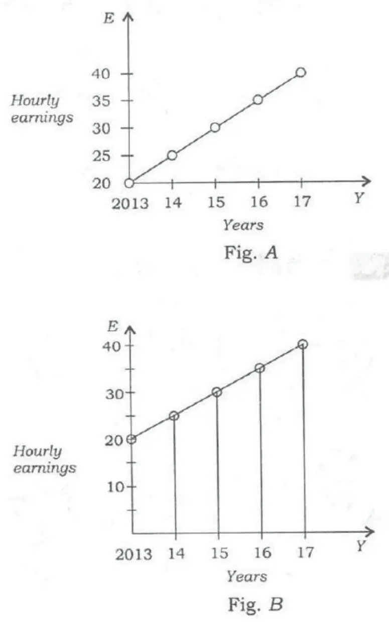
2018 · Q65
Average hourly earnings per year (E) of the workers in a firm are represented in figures A and B as follows:
From the figures, it is observed that the
(a)values of E are different
(b)ranges (i.e., the difference between the maximum and the minimum) of E are different
(c)slopes of the graphs are sameUPSC key
(d)rates of increase of E are different
Show answerHide answer
UPSC key: (c)
Data interpretation and sufficiency · Graphs
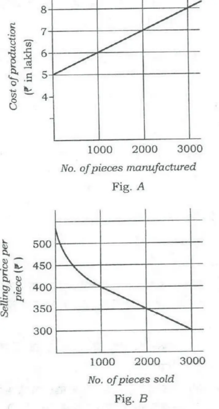
2018 · Q67
Consider the following figures A and B:
The manufacturing cost and projected sales for a product are shown in the above figures A and B respectively. What is the minimum number of pieces that should be manufactured to avoid a loss?
(a)2000UPSC key
(b)2500
(c)3000
(d)3500
Show answerHide answer
UPSC key: (a)
Data interpretation and sufficiency · Graphs
2018 · Q71
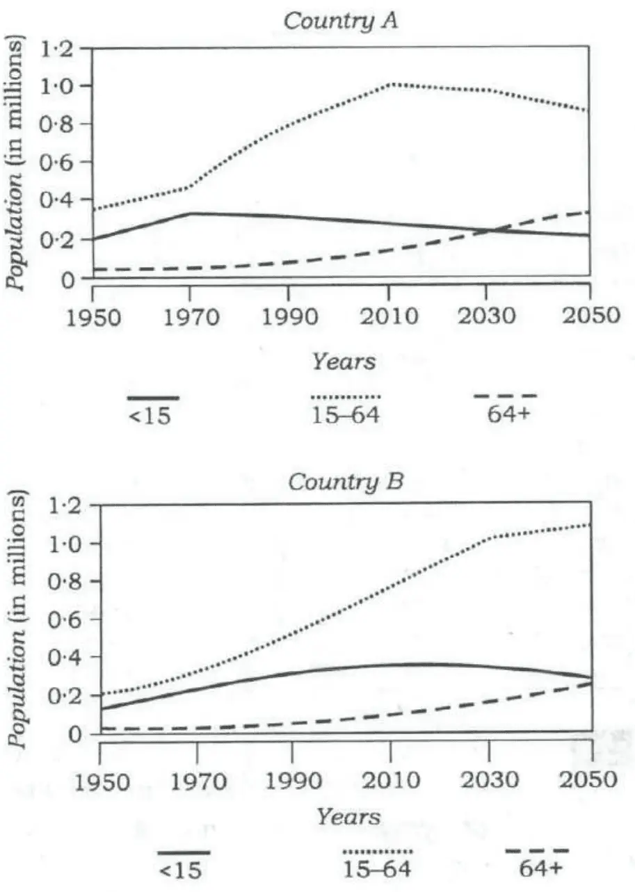
Consider the following graphs. The curves in the graphs indicate different age groups in the populations of two countries A and B over a period of few decades:
With reference to the above graphs, which of the following are the most logical and rational inferences that can be made?
1.Over the last two and a half decades, the dependency ratio for country B has decreased.
2.By the end of next two and a half decades, the dependency ratio of country A will be much less than that of country B.
3.In the next two decades, the workforce relative to its total population will increase in country B as compared to country A.
Select the correct answer using the code given below.
(a)1 and 2 only
(b)2 and 3 only
(c)1 and 3 onlyUPSC key
(d)1, 2 and 3
Show answerHide answer
UPSC key: (c)
Data interpretation and sufficiency · Graphs
2018 · Q73
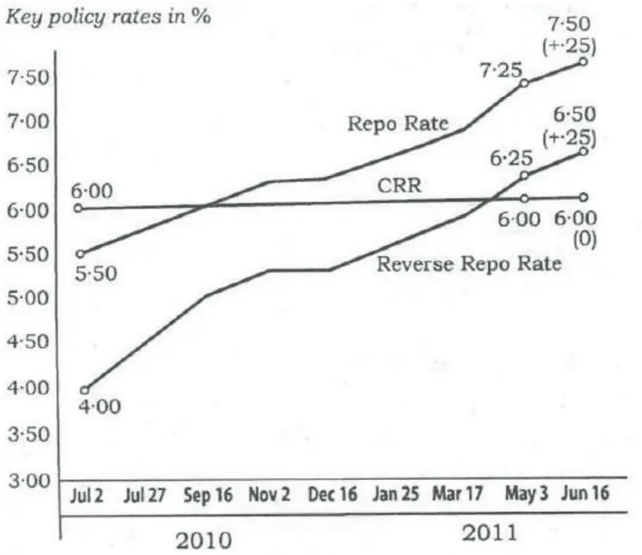
The graph given below indicates the changes in key policy rates made by the Central Bank several times in a year:
Which one of the following can be the most likely reason for the Central Bank for such an action?
(a)Encouraging foreign investment
(b)Increasing the liquidity
(c)Encouraging both public and private savings
(d)Anti-inflationary stanceUPSC key
Show answerHide answer
UPSC key: (d)
Data interpretation and sufficiency · Graphs
2018 · Q76
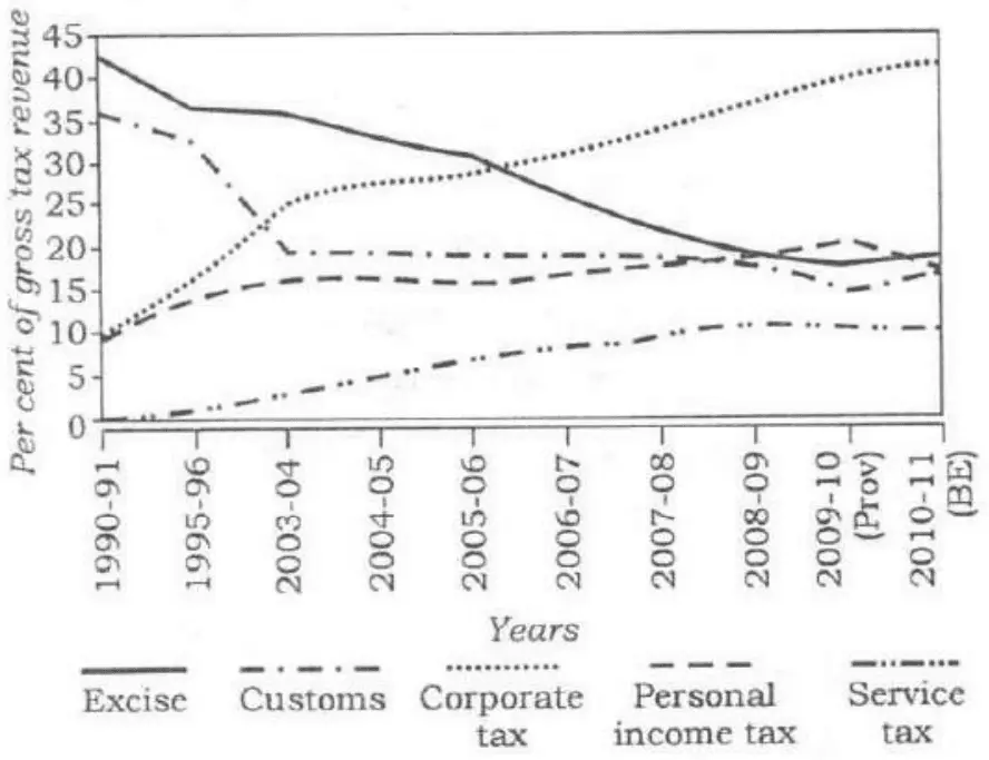
The following graph indicates the composition of our tax revenue for a period of two decades:
With reference to the above graph, which of the following is/are the most logical and rational inference/inferences that can be made?
1.During the given period, the revenue from Direct Taxes as percentage of gross tax revenue has increased while that of Indirect Taxes decreased.
2.The trend in the revenue from Excise Duty demonstrates that the growth of manufacturing sector has been negative during the given period.
Select the correct answer using the code given below.